Rodenbach wanted some new merch for in their shop in Het Foederhuis. I was honored to make some designs for them. Below you will find the designs I created and and an explanation to go along with it. To promote these new clothes I was invited for an interview that was published in a few papers. You can find one such article here!

2025

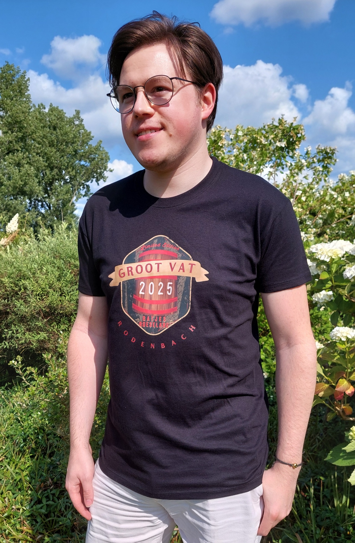
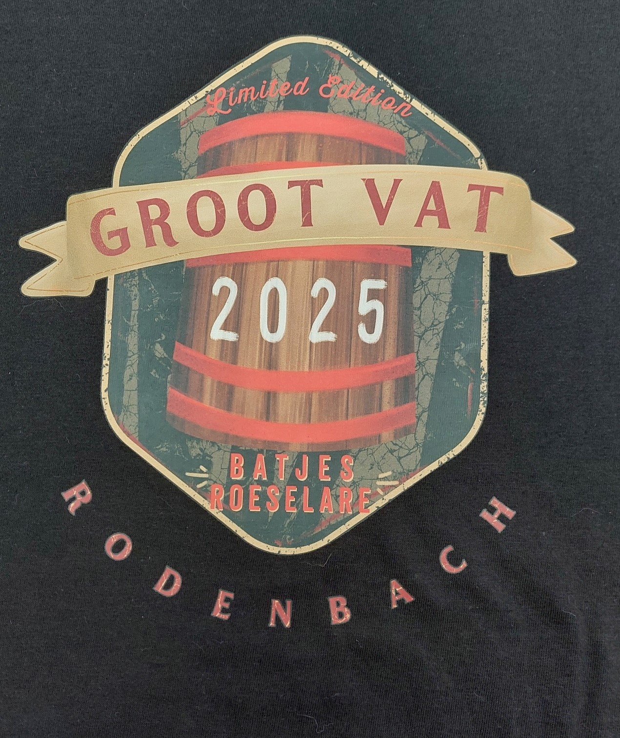
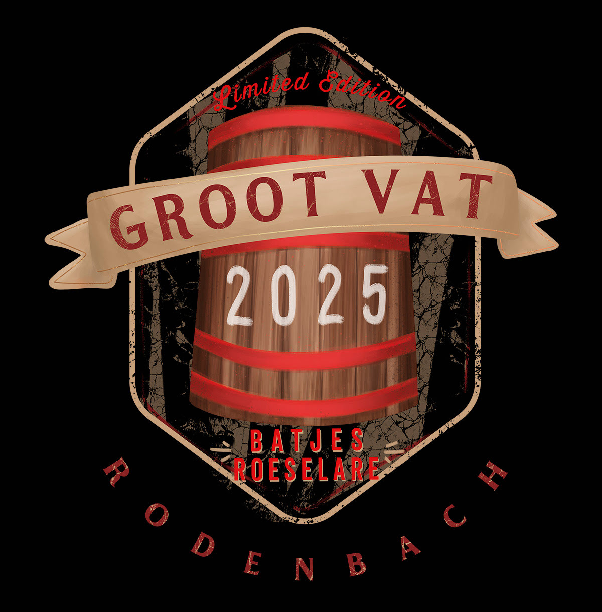
Firstly they wanted a limited edition t-shirt for an event called 'Het Groot Vat' during the 'Batjes' in Roeselare. They wanted their iconic big foeder in the design and the year of the edition. Otherwise I was free to give it my own vintage spin. I based myself on the kinds of designs that are on Hard Rock t-shirts and added some grunge textures as a background. The shirt was printed on black and white shirts and have a limited print, since it's for an event. Rodenbach do want this design to return for the next edition of the 'Batjes', with a different year on it of course. The current Rodenbach logo can be found on the back, below the neck.
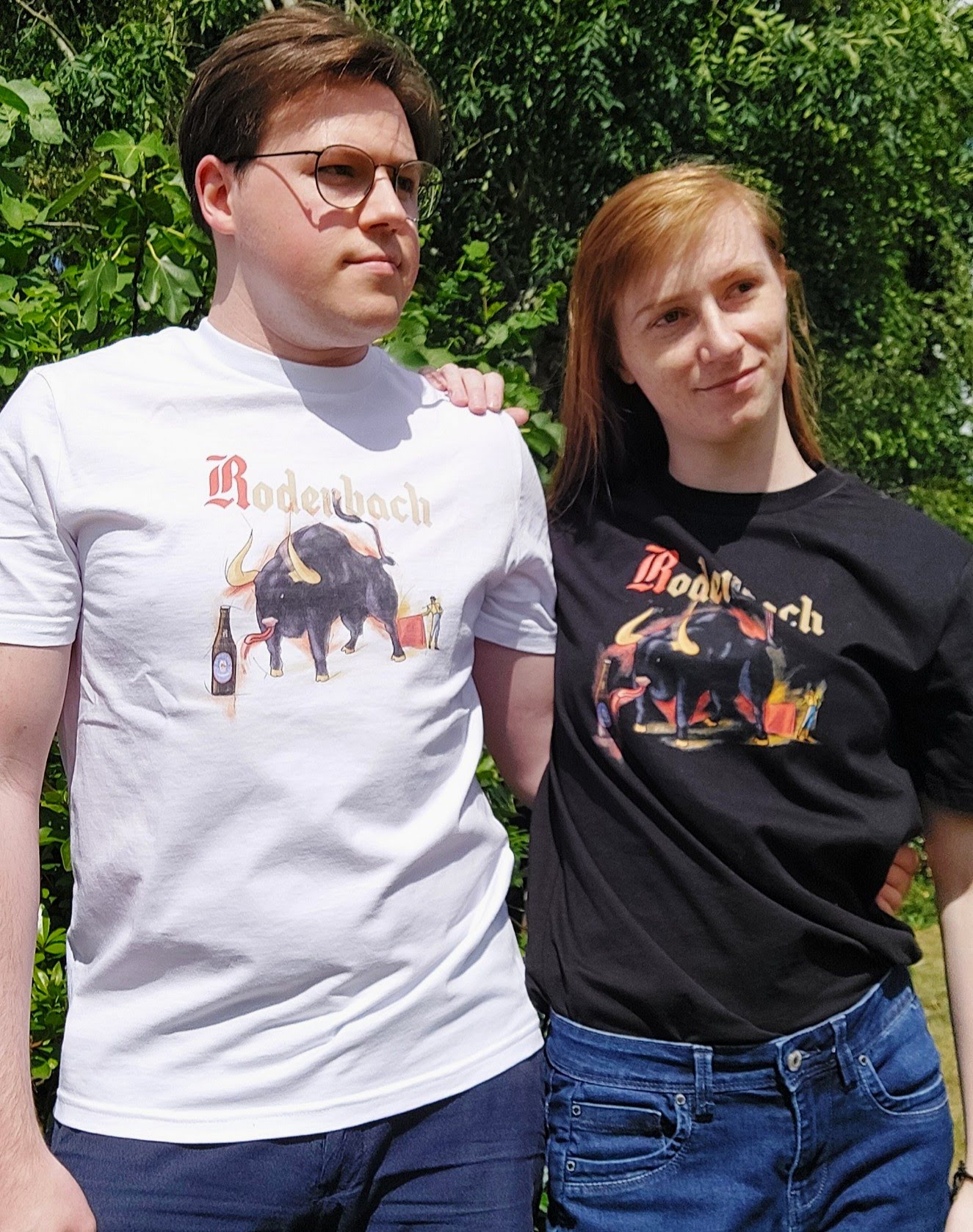
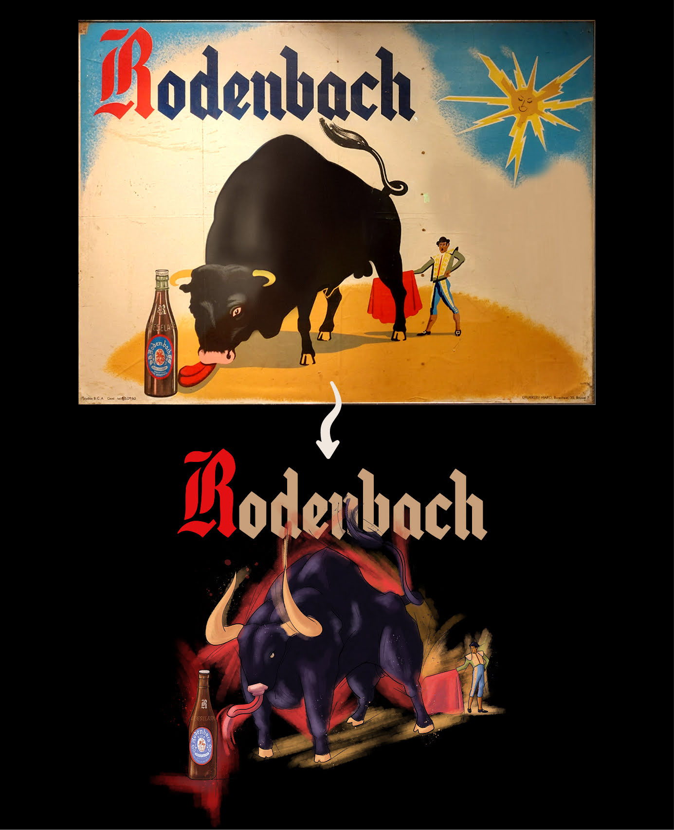
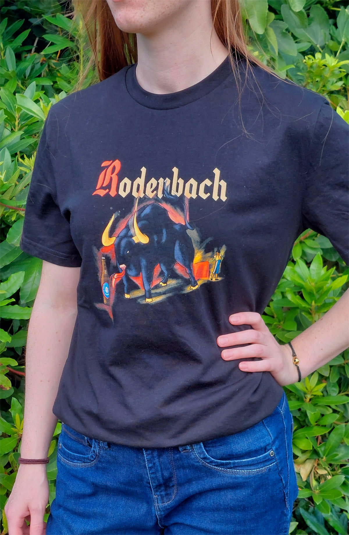
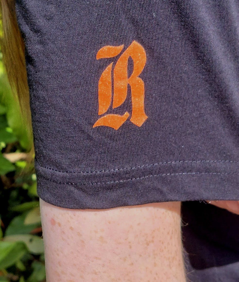
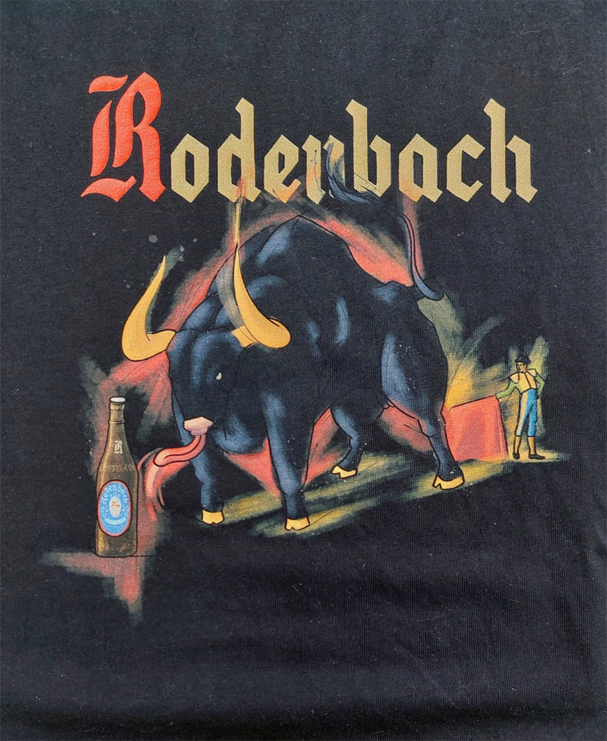
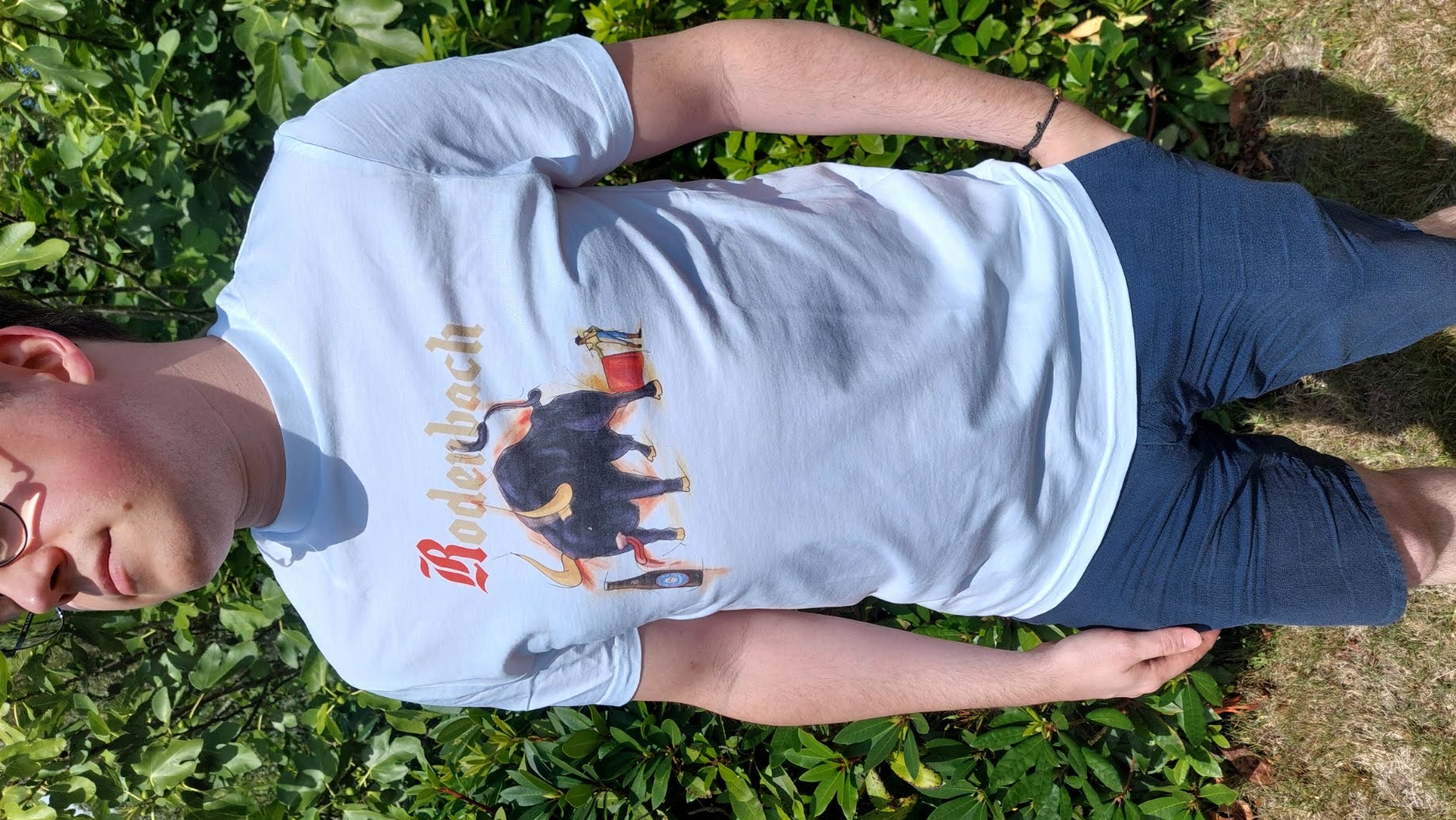
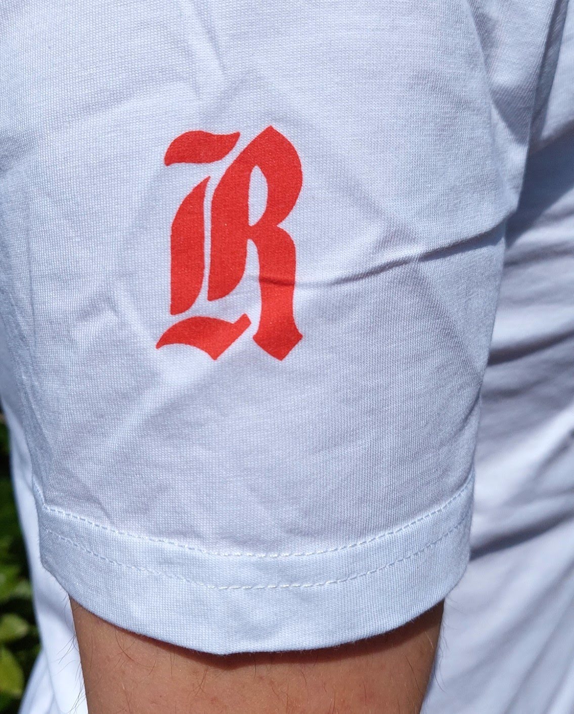
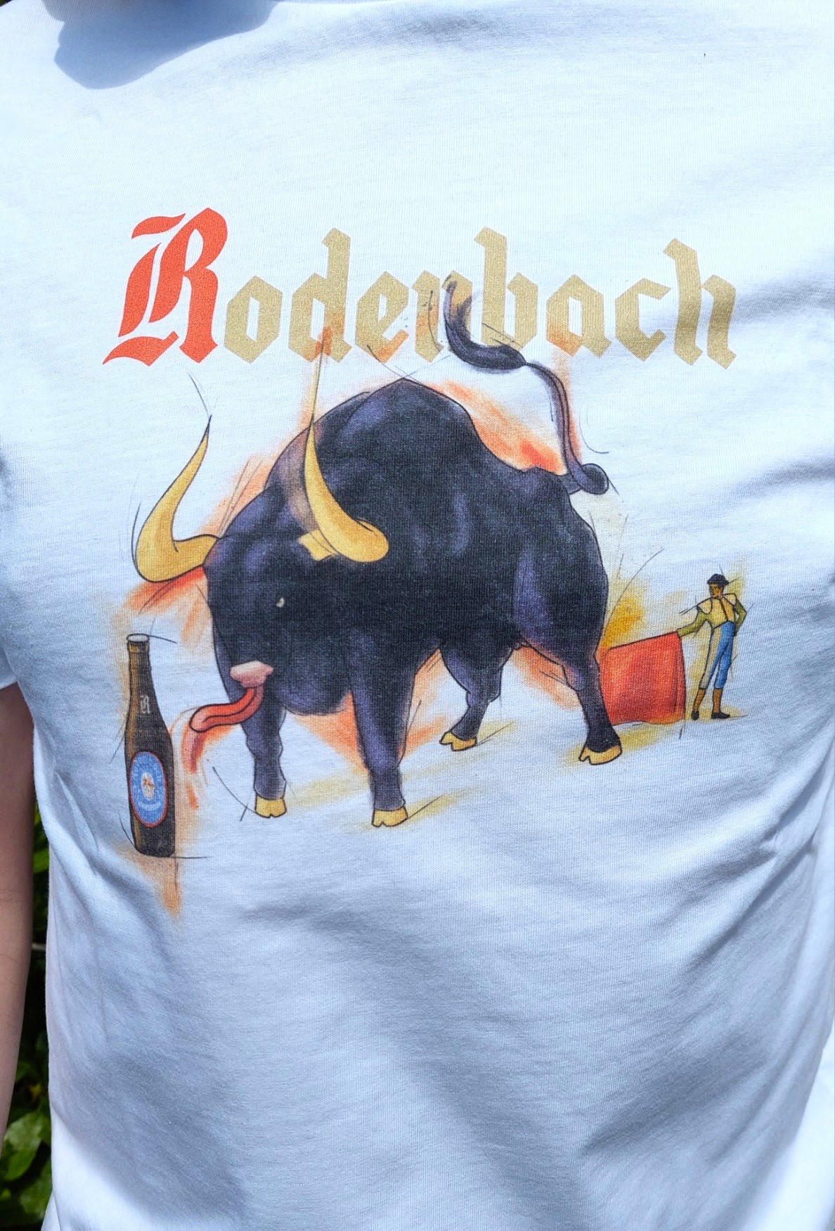
Rodenbach wanted some designs based on old advertisements from 1960. These iconic old images are found when you visit the brewery. The bull is one of them. A massive image of a bull looking towards a Rodenbach instead of the matador. This was a campaign from 1960 by Rodenbach in Spain. I repainted the image to have a more modern look and more accurate physiology. I added some painterly strokes in the background for a more painted vintage look. This design was printed on black and white -t-shirts. The old, iconic R of Rodenbach is on the sleeve of the shirt. I repainted this from the original to have a more high quality version. They also printed the design on a dark blue sweater. On the sleeve of the sweater you can find the words "Wild van Rodenbach" (wild for Rodenbach) written in my handwriting, referencing the bull who is wildly looking at the bottle of Rodenbach. The current Rodenbach logo can be found on the back, below the neck.
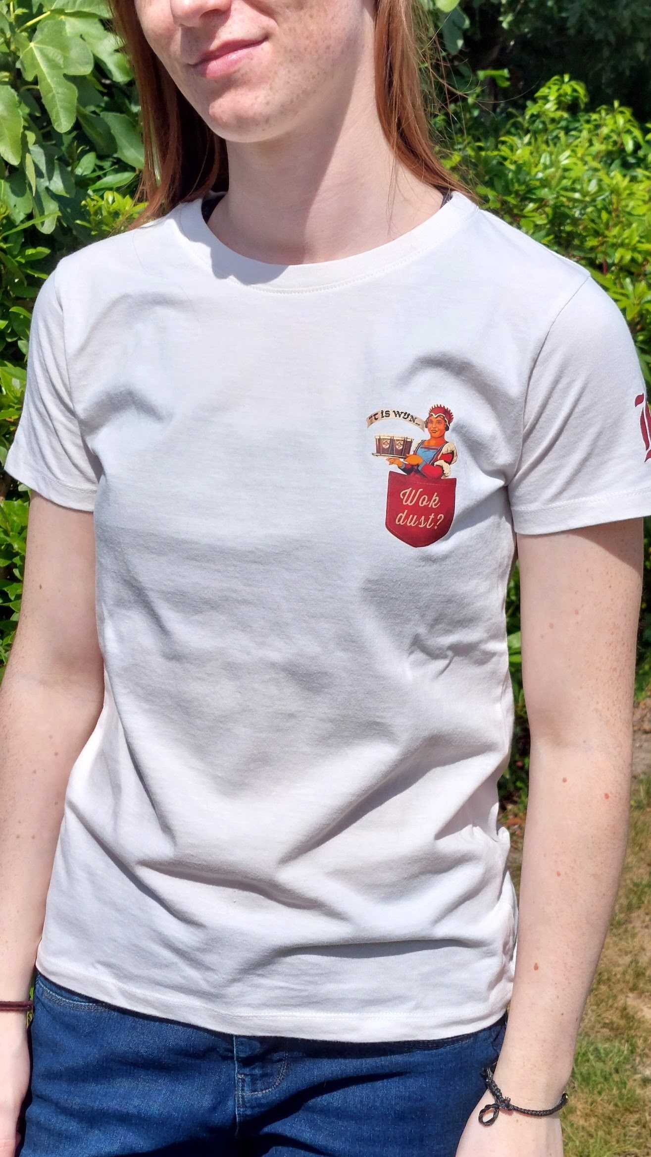
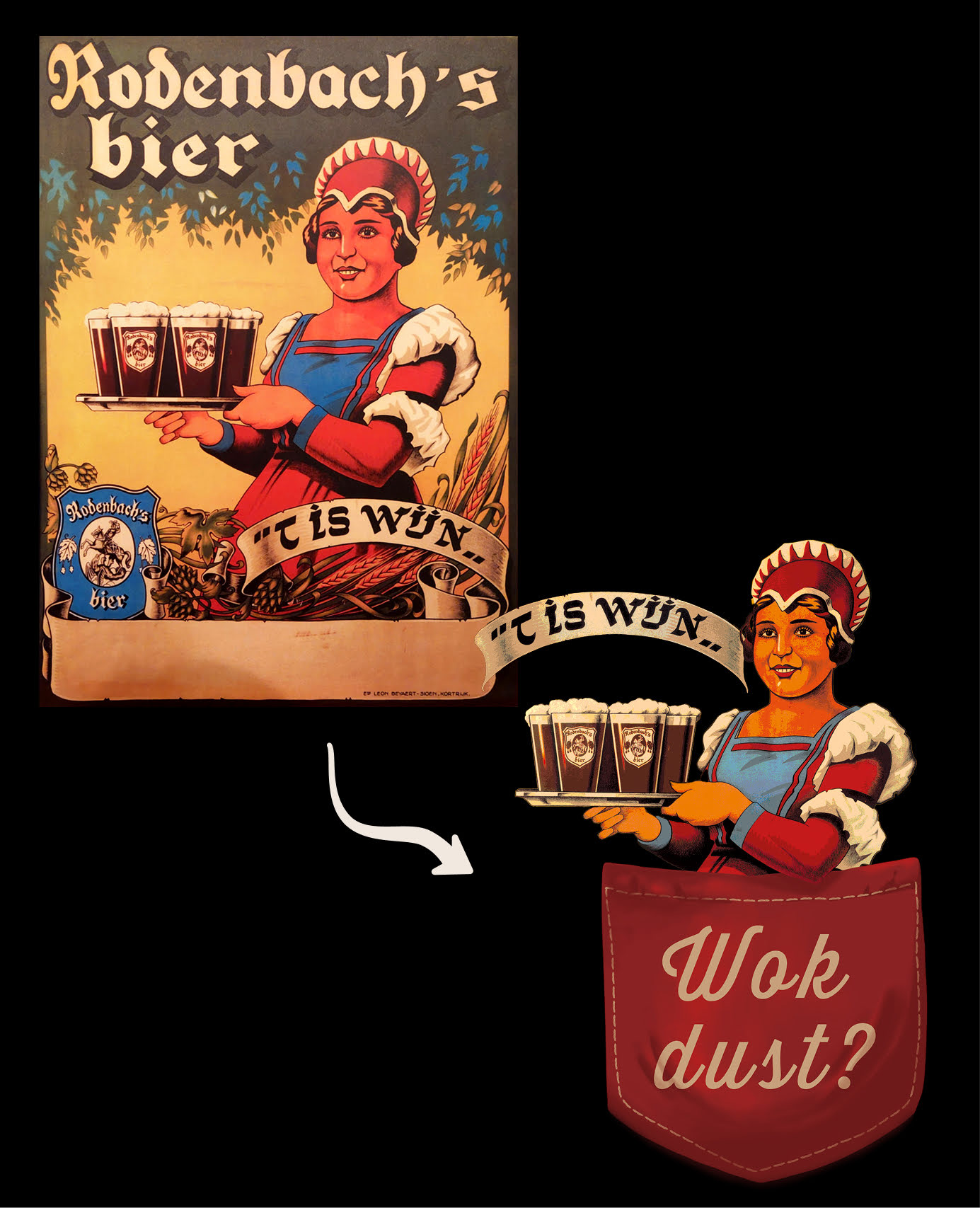
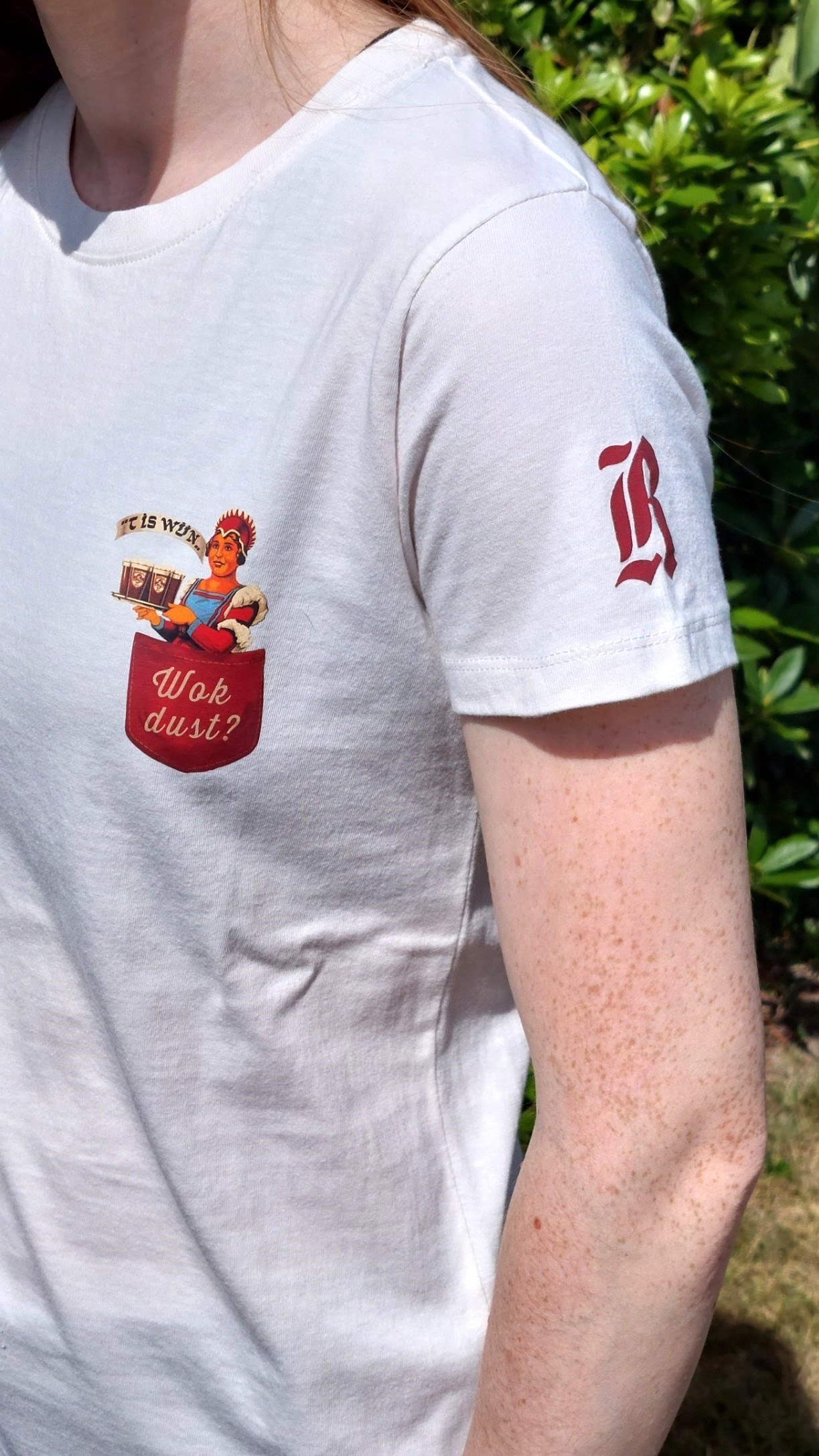
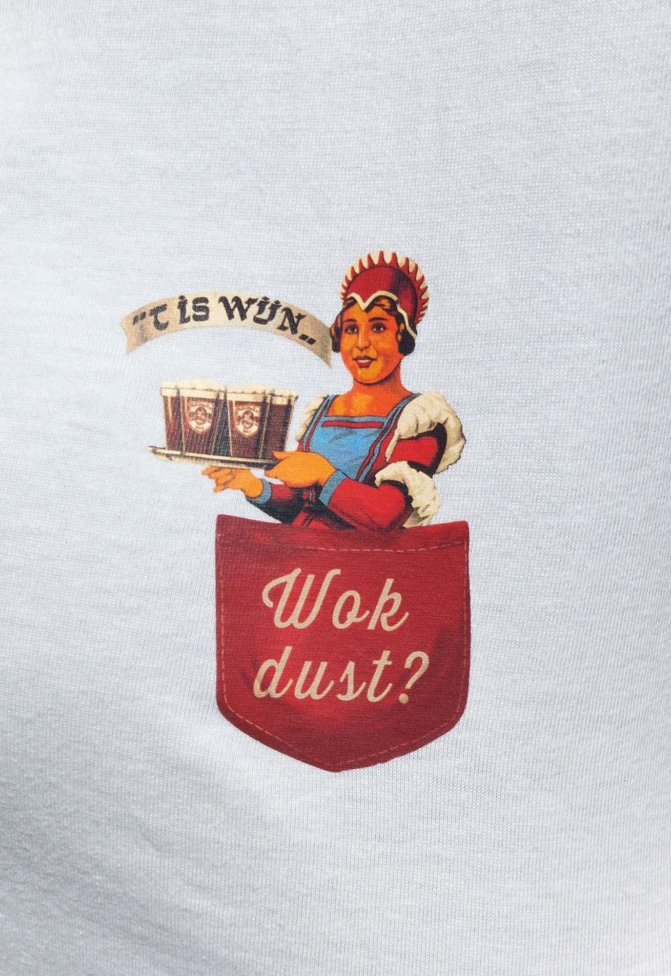
Another advertisement from 1960 is 'aunt Yvonne', at least that is how she is called in the brewery. The image is of a woman proffering a plate of Rodenbachs. Below her it says "t'is wijn" (it's like wine) making the comparison between the taste of Rodenbach and wine. I extracted her from her poster environment and nestled her in a breast pocket I painted in the red of Rodenbach. I also added stitches on the pocket to make it resemble real clothes a bit more. On the pocket I added some West-Flemish, since the brewery is proud of its West-Flemish heritage, "Wok Dust?" (also thirsty?). On the sleeve of the shirt you can find the classic old R of Rodenbach. The design is printed in beige for women and a dark beige for men. The current Rodenbach logo can be found on the back, below the neck.
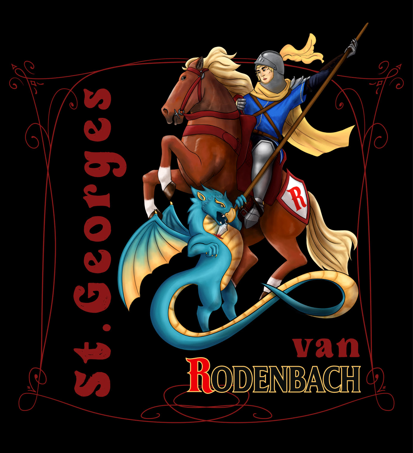
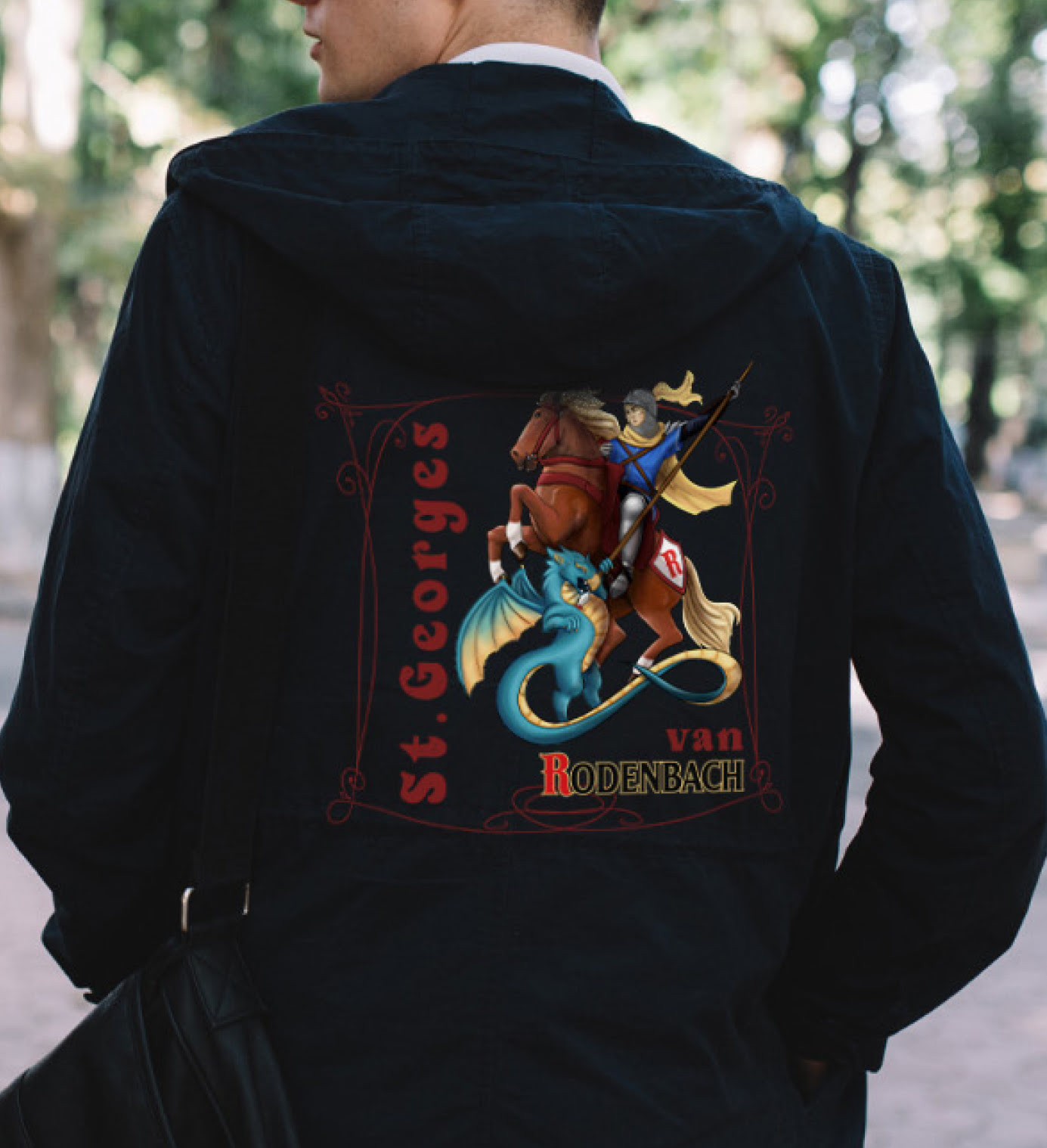
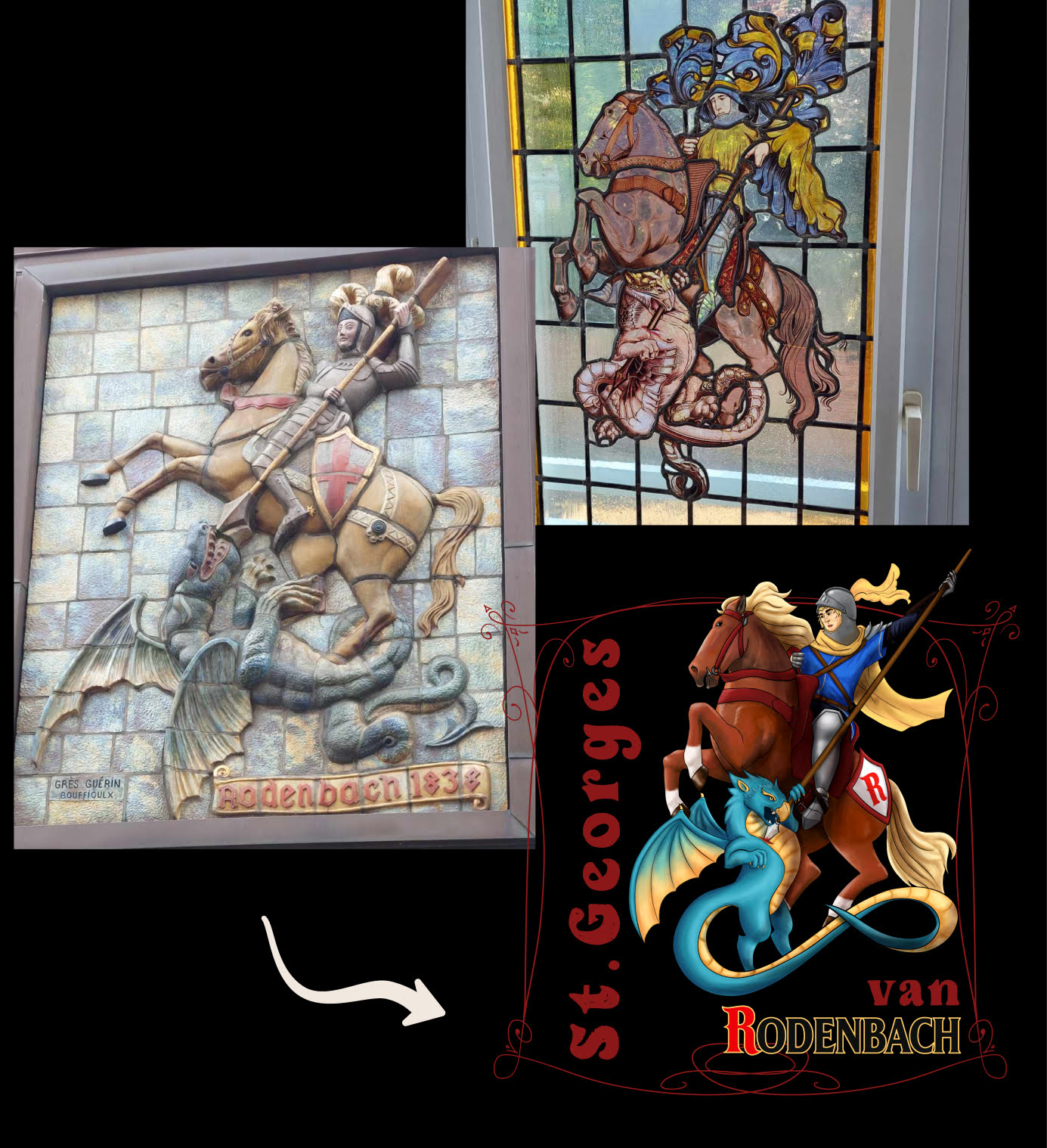
Saint George is the patron saint of brewery Rodenbach. On one of the courtyards of the brewery you can see a massive relief sculpture of Saint George on his horse killing a dragon. They also have a few stained glass windows depicting the same scene. A really cool image I really wanted to give my own spin. I stayed true to the original composition but drew and painted everything in my semi realistic style. I added "St George van Rodenbach" in the design so people would know what it was supposed to be. It is planned that this design will be printed on a hoodie. For now I have made a mockup of what it is supposed to look like on clothing.